The Field Guide
The Official Yellowstone Blog
Introducing App Analytics
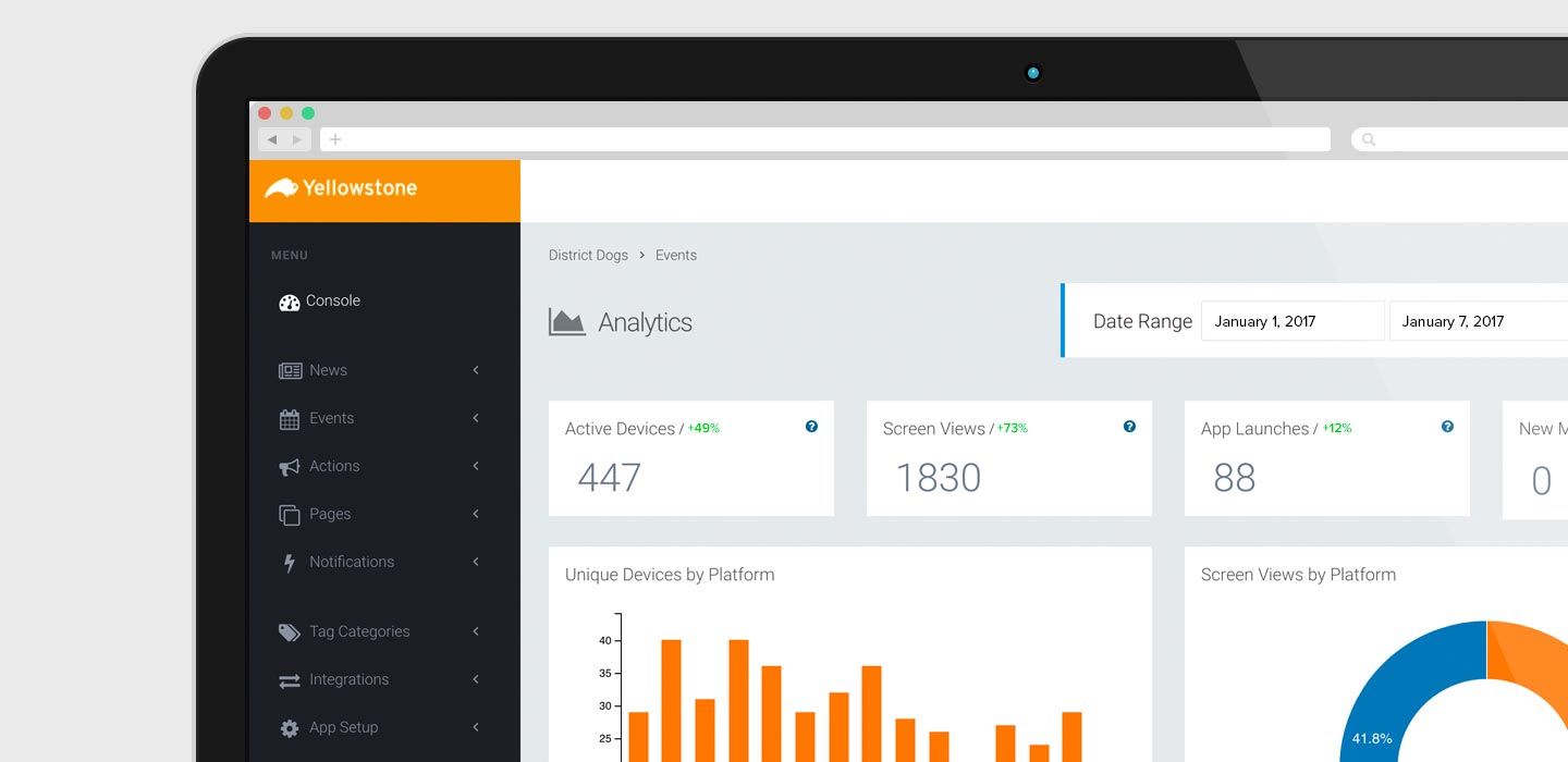
Take a look at what's going on inside your app.
Today we are rolling out the single largest change to the Yellowstone Console: app analytics. Now every time you log into your account Yellowstone will present a usage overview of your app on the home page. The data presented is specifically tuned to provide the most complete and up-to-date overview of your app in a way that simpler stats – like app downloads – cannot.
Here's what you can expect next time you log into the Yellowstone Console:
Once you know what you're looking at, this will be a great resource to understand what's going on with your app.
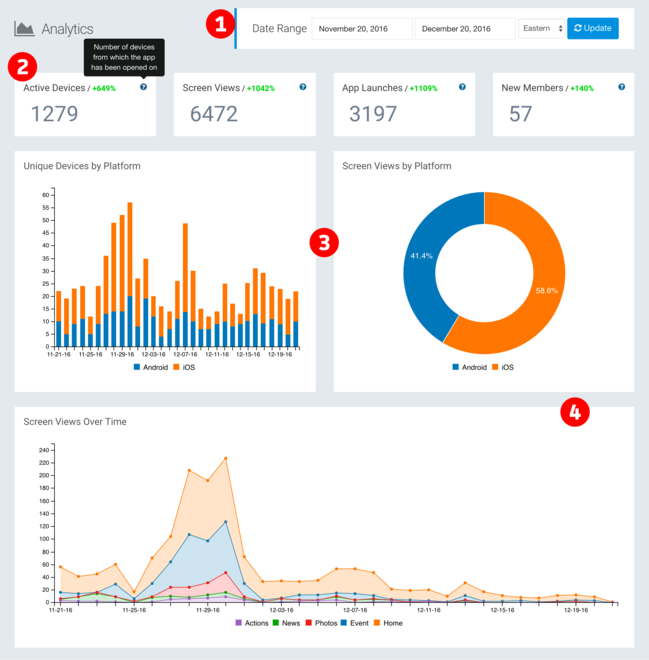
(1) Date Range
Here you can change the time period that the data draws from. While we're launching this tool today, your data goes back to about mid-November. You can choose any number of days and all the data on the page will update accordingly. The time zone you choose should have little impact on the data that’s displayed, but it is necessary to determine when a day starts and when a day ends.
(2) Numeric Data
Across the top of the analytics page are four key metrics: Active Devices, Screen Views, App Launches, and New Members. These four metrics are better indicators about how your app is doing than app downloads. Like all the data on this page, these numbers will change depending on your chosen date range.
Yellowstone will also display a percent-change next to the numeric data title; green for positive change, red for negative change. The percent-change is calculated by comparing the current data to past data. For example, if you select one week of data to display, Yellowstone will compare that to the previous week’s data and show you the percent-change between the two weeks. If you select ten days of data, Yellowstone will compare those ten days to the previous ten days.
Here's what the numeric data numbers across the top of your console mean:
- Active Devices: This is the total number of devices the app has been launched on
- Screen Views: The total number of individual screens viewed in the app – this is most similar to page views on the web
- App Launches: The number of times the app has been opened
- New Members: Probably the most self-explanatory: the number of new accounts created by your members
We've included tooltips – a little blue circle with a ? in it – that will tell you what the numeric metric is for future reference when you mouse-over it.
(3) Platform Stats
These two charts show break out app usage by platform. The first, Unique Devices by Platform, shows you both total number of unique devices each day (the full height of the bar) as well as the breakdown between Android (blue) and iOS (orange). Mouse-over any bar and Yellowstone will tell you the exact number of iOS users and Android users for that day.
The pie chart, Screen Views by Platform, gives you a quick glance at what percentage of your members are using Android (blue) and iOS (orange).
(4) Screen Views Over Time
The final stacked line chart across the bottom breaks down screen views over time. Here you can see which screens are most popular both over the selected date range as well as over individual days. Mouse-over on a given day and Yellowstone will display the data for that day.
This is just the beginning of analytics in Yellowstone. We plan on continuing to roll out more analytics tools across the console to give you insights into how your app is being used.